Definition
Various indicators can serve as benchmarks for network connectivity of transport infrastructure. In GOAT, a heatmap showing the connectivity of the path network is integrated. It can currently be calculated for the walking mode and visualises the connectivity of footpaths on a hexagonal grid. This allows users to identify areas of high and low connectivity in the study area. This is particularly important for the promotion of active modes (walking and cycling), as these modes are sensitive to detours.
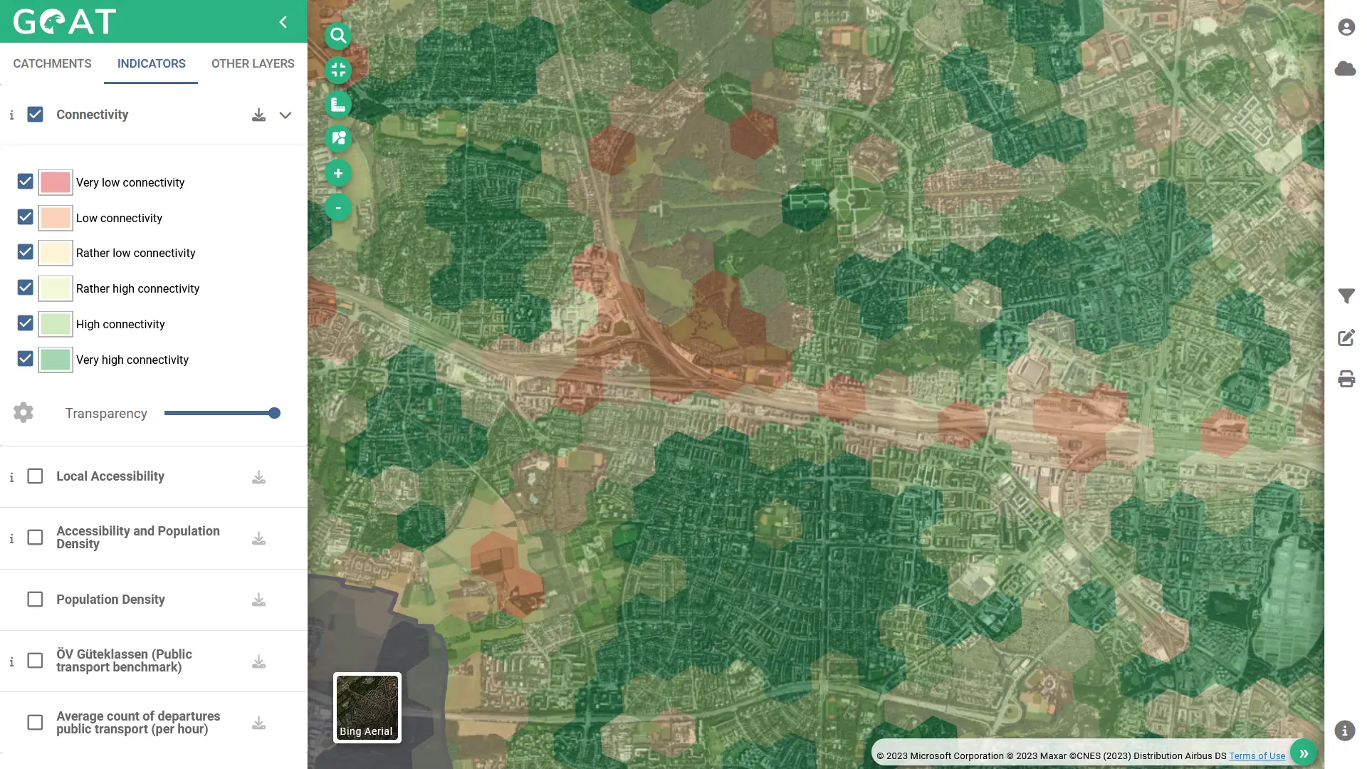
The connectivity heatmap is based on the isochrone calculation. From the centroid of each hexagon, the walking catchment area is computed. Based on the size of the catchment area, the hexagons are categorized in very low (red) to very high connectivity (green).

Figure 1: Sample results of the Connectivity Heatmap in GOAT
Typical areas with low connectivity are along railway lines and large main roads. High connectivity values are often found in residential areas with dense path networks.
Which planning questions can be answered?
- How well is footpath network connected?
- Where are connectivity issues?
- Where are barriers for pedestrians in the context of street network connectivity?
Calculation
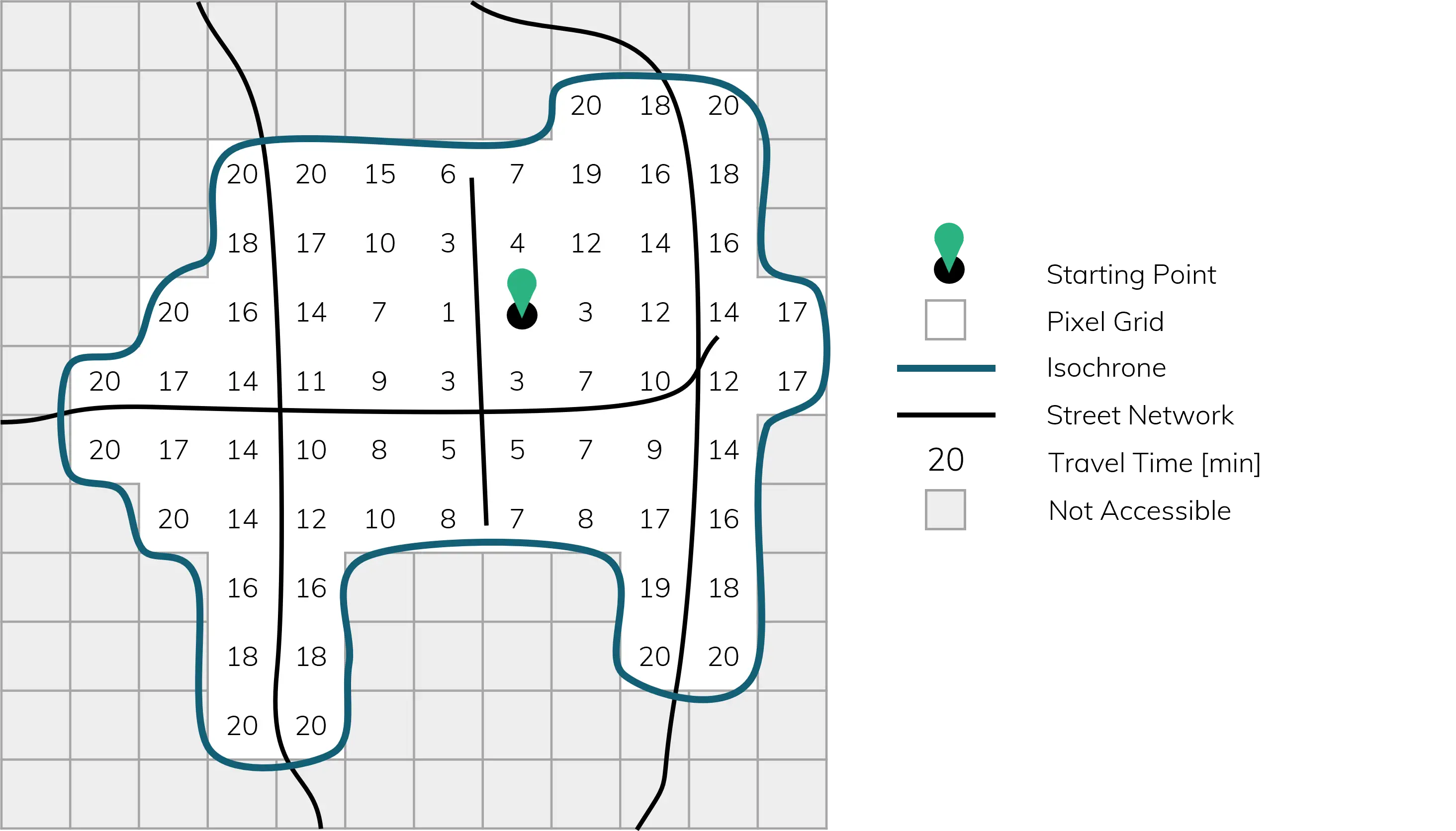
In GOAT, the connectivity heatmap is calculated using the H3 hexagonal grid with an edge length of approximately 66 m per cell. For each hexagon centroid, the reached area is computed using an isochrone with the maximum walking time of 20 minutes (with 5km/h). This calculation returns the travel time from the centroid to each pixel of the isochrone (as indicated in Figure 2 below).

Figure 2: Travel time from the centroid to each pixel grid of the isochrone
The connectivity value is computed by summing up the reached area for each time interval (1 to 20 min) and dividing the sum by the total number of intervals (20):

Figure 3: Formula to compute the average reached area
The resulting connectivity values are classified into six levels, from highest to lowest as quintile classification. This classification helps to identify areas with relatively small or large catchments, allowing to locate gaps in the network and potential areas for improvement.
Visualization
In GOAT, the connectivity heatmap is visualized using a hexagonal grid with an edge length of approximately 174 m per cell. Accordingly the resolution for the visualization is lower than the resolution used for the calculation. The higher resolution for the calculation is necessary to ensure a precise calculation of the connectivity. While the lower resolution for the visualization is chosen to ensure a smooth rendering of the connectivity heatmap. The data on the higher resolution is aggregated to the lower resolution by computing the average connectivity.
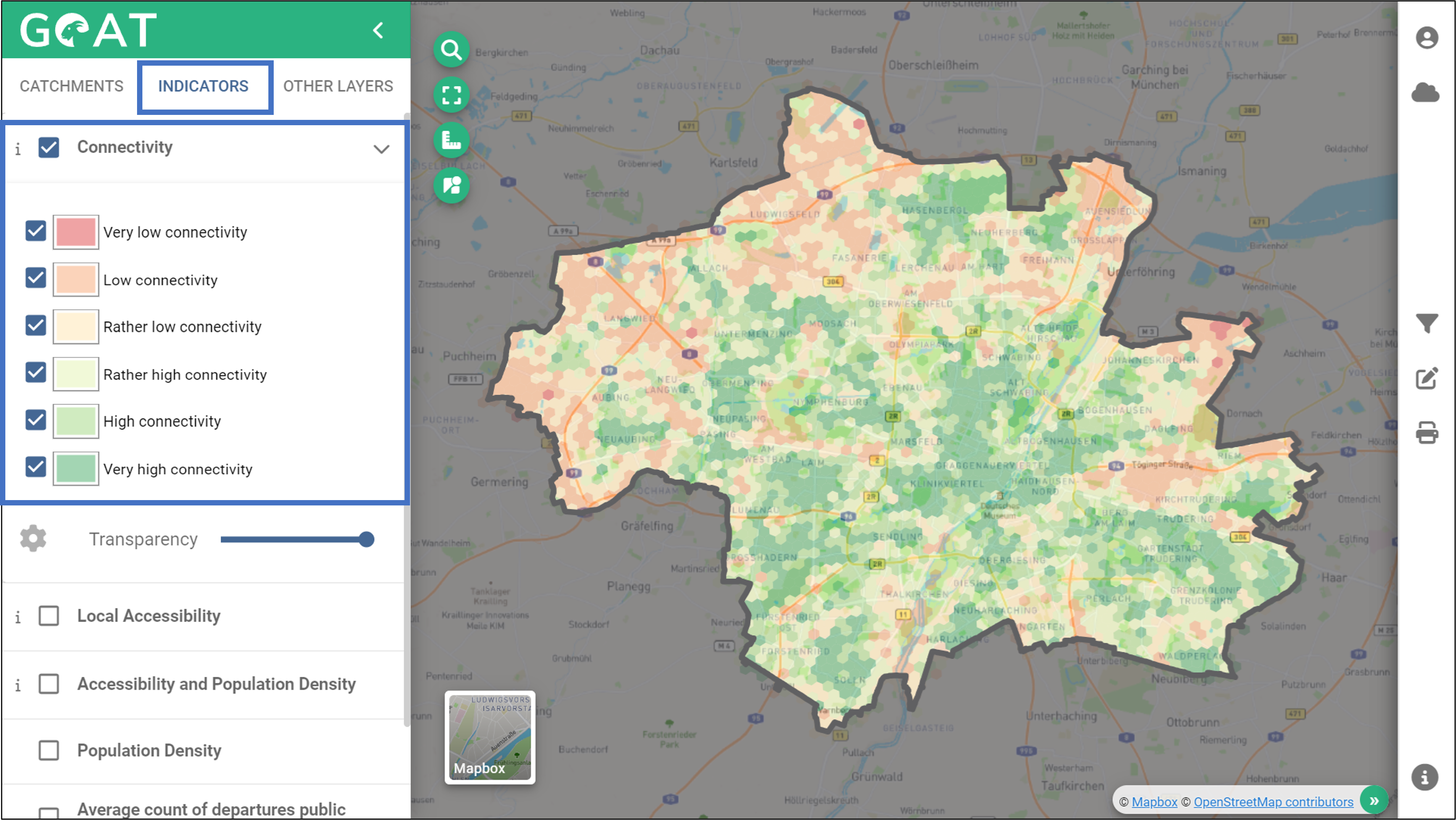
The classified hexagons are colored from high (green) to low (red ) connectivity, giving the user a clear overview of the network quality throughout the study area.

Figure 4: Connectivity Heatmap in GOAT
