Definition
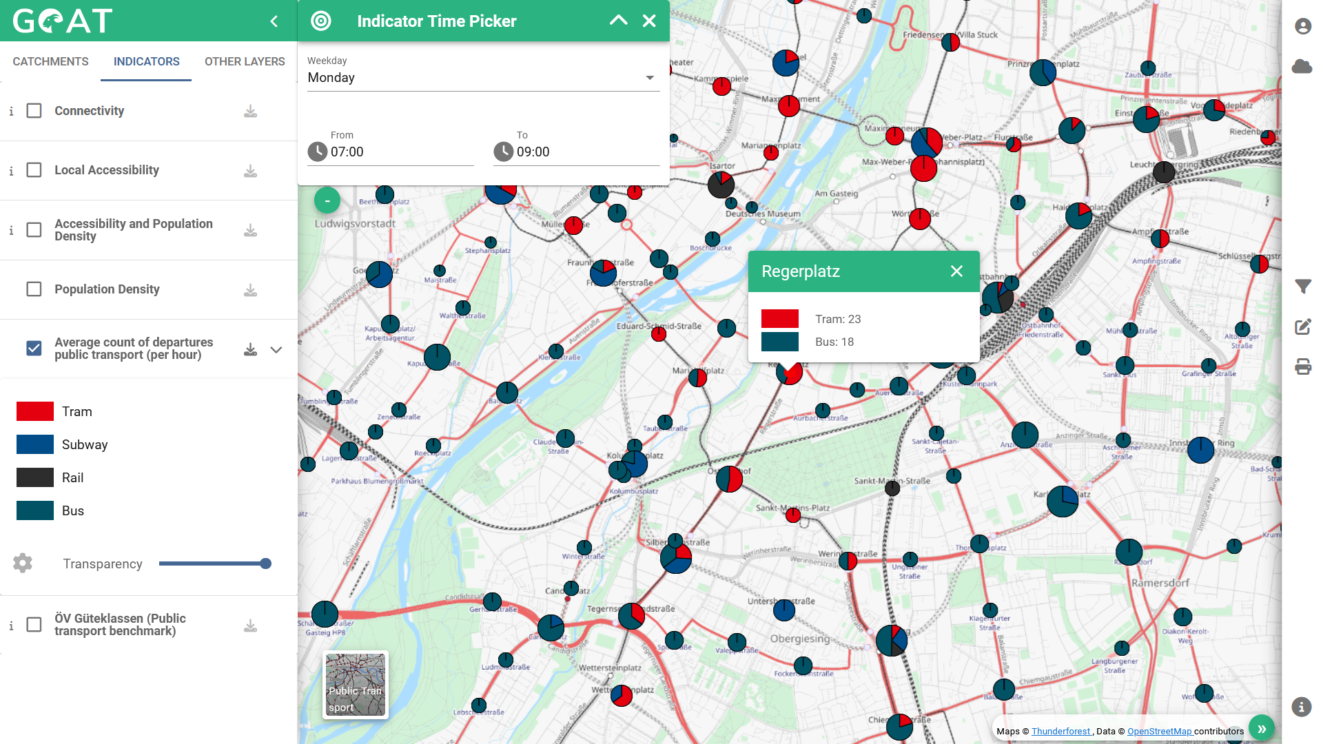
This indicator shows the average number of public transport departures per hour for a selected time interval in pie charts. The size of the pie chart represents the number of departures: the larger the pie chart, the more departures. The colours represent the type of service (e.g. bus, metro).
This indicator serves as the foundation for the ÖV Güteklassen, but can also be utilized on its own as a straightforward measure for public transport offer at a station level. It gives a summary of a station’s departures during a specific time window and day, providing a valuable overview of the public transport offer in a city. Thus, the indicator is often used in weak point analyses of local transport plans (see, among others, Guideline for Local Transport Planning in Bavaria).

Figure 1: GOAT Interface - Average count of public transport departures
What planning questions can be answered?
- Which stations in the city serve as main hubs?
- Which stations have low service rates in comparison to others?
- How does the public transport quality vary over different times of the week or day?
Calculation
Similar to the ÖV Güteklassen (public transport quality classes), this indicator is calculated on the basis of GTFS data. Based on the selected day and time window, the average number of departures per hour (regardless of direction) is calculated.
References
Shkurti, Majk (2022). Spatio-temporal public transport accessibility analysis and benchmarking in an interactive WebGIS
