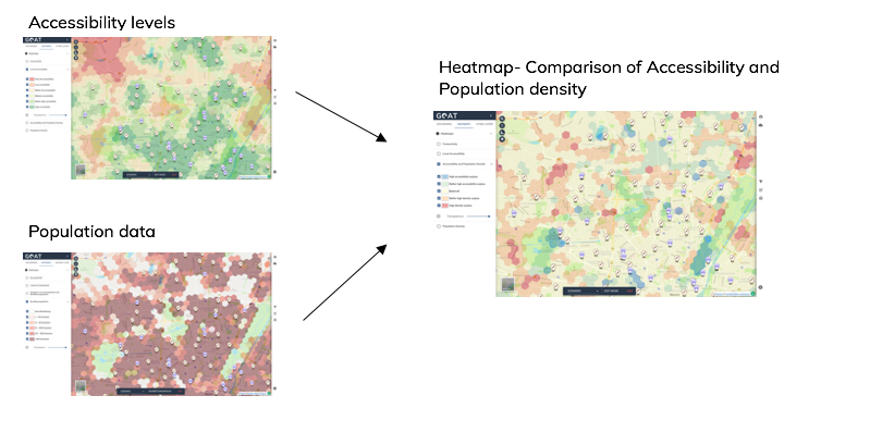
In addition to the Local Accessibility Heatmap, GOAT allows you to visualize another heatmap called “Comparison of Accessibility and Population Density”. This heatmap gives a better understanding of the accessibility in a specific area or neighborhood based on its population. This heatmap can be used to answer many planning questions. Among them:
- Where can an accessibility surplus be found in the studied neighborhood?
- Where can a density surplus be found in the studied neighborhood?
- Where is potential for is densification?
- Where is an improvement of accessibility to specific amenities or public transport stations needed?

1. Calculation
The comparison heatmap is the result of the intersection of the two heatmaps “Local Accessibility” and “Population Density.”
2. Classification
In order to classify the accessibility levels that were computed for each grid cell, a classification based on percentiles is used. The following table shows how the percentiles of accessibility and population are calculated in each grid.
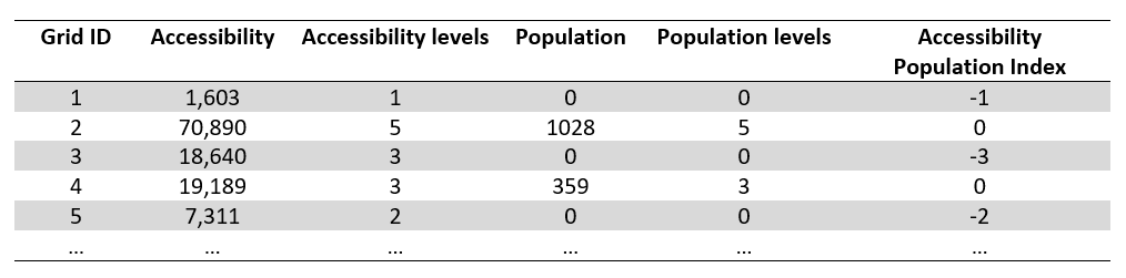
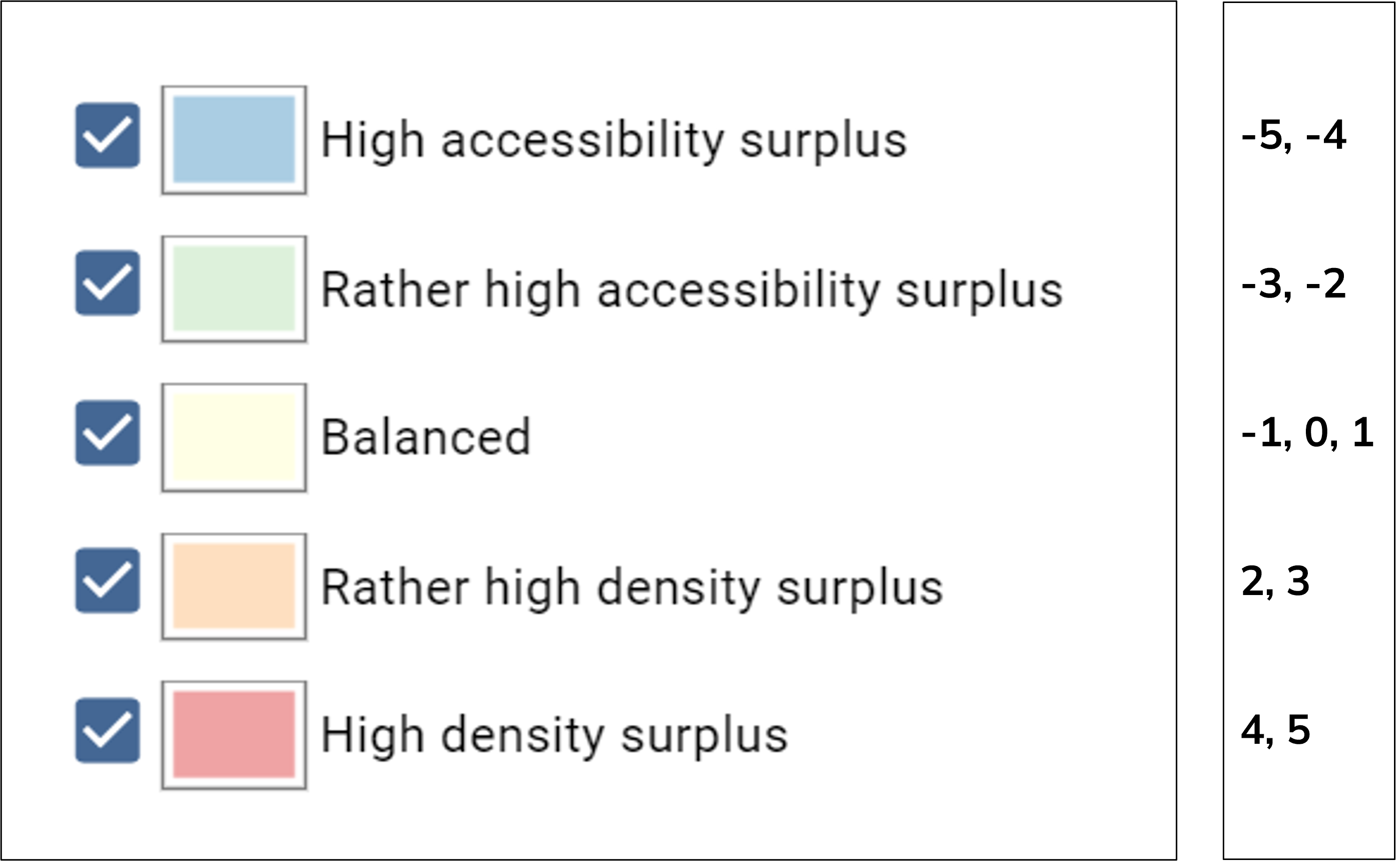
The “Comparison of Accessibility and Population Density” heatmap is calculated as following:
Index = Population Level – Accessibility Level
and shows following result: