
Description of the feature
GOAT allows you to perform analyses on public transport quality and accessibility. Therefore, mainly two indicators are provided: “ÖV Güteklassen" and the “Average count of departures”. Moreover, GOAT also allows to calculate Isochrones for different transit modes by considering infrastructure network and traveling time.
Possible use cases (planning questions)
- How good is the public transport offer at a specific location?
- Which parts of the city show a low public transport supply?
Video Tutorial
Step-by-step tutorials for an exemplary planning task
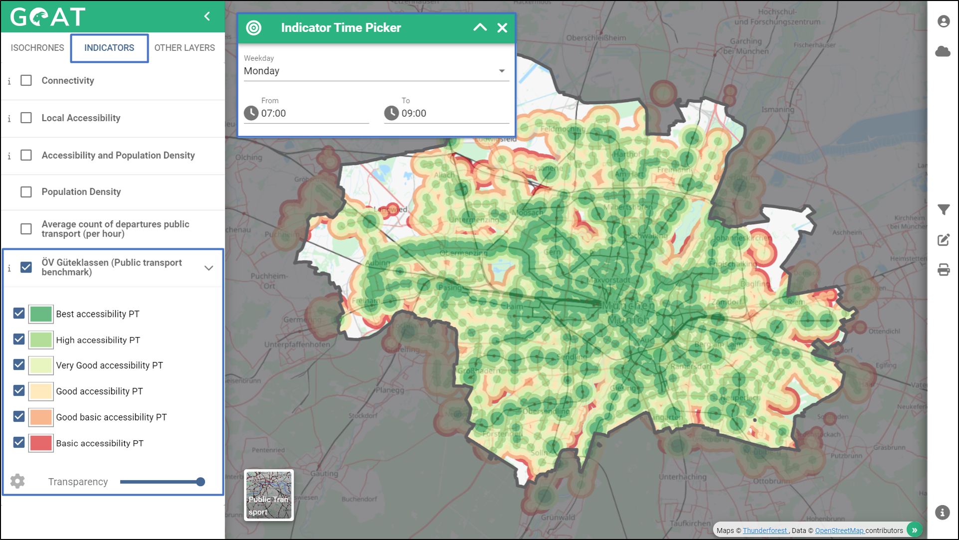
- Enable “ÖV Güteklassen (Public transport benchmark)” from “Indicators” section. The map will be automatically created with the default day and time range. With the help of the legend, you can see how good the public transport supply in different location is.
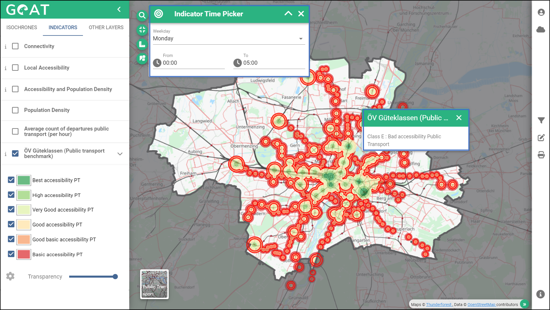
- Change the time interval to nighttime to see the difference in public transport supply. Click somewhere on the map and see the details of the public transport benchmark. The green areas (Class A) show areas with a high-quality public transport offer and the red areas (Class F) show areas with low supply.
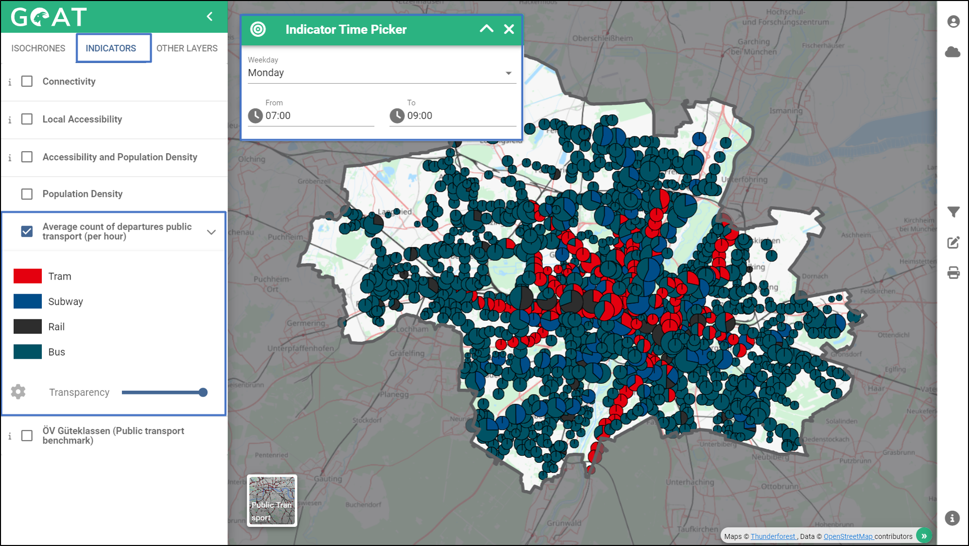
- Enable “Average count of departures public transport (per hour)” from the “Indicators” section. The map will be automatically created with the default day and time range. The pie charts show the number of departures per transport stop.
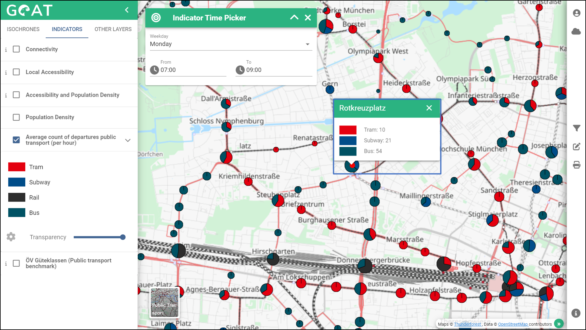
- If you want to get further insights, zoom in to the area where you want to see the number of departures and click on the pie chart. The pop-up window shows the number of departures per transport mode at this stop.
- If you want to additionally analyze, how good public transport accessibility to/from a certain location is, you can calculate public transport isochrones. How this works is explained in the Isochrones tutorial.